
Lighting Guide · 3 min read
How to Choose the Right Colour Temperature for Your Space
The right colour temperature can completely change the character of a space. Learn how to select lighting that complements the purpose and atmosphere of each room.
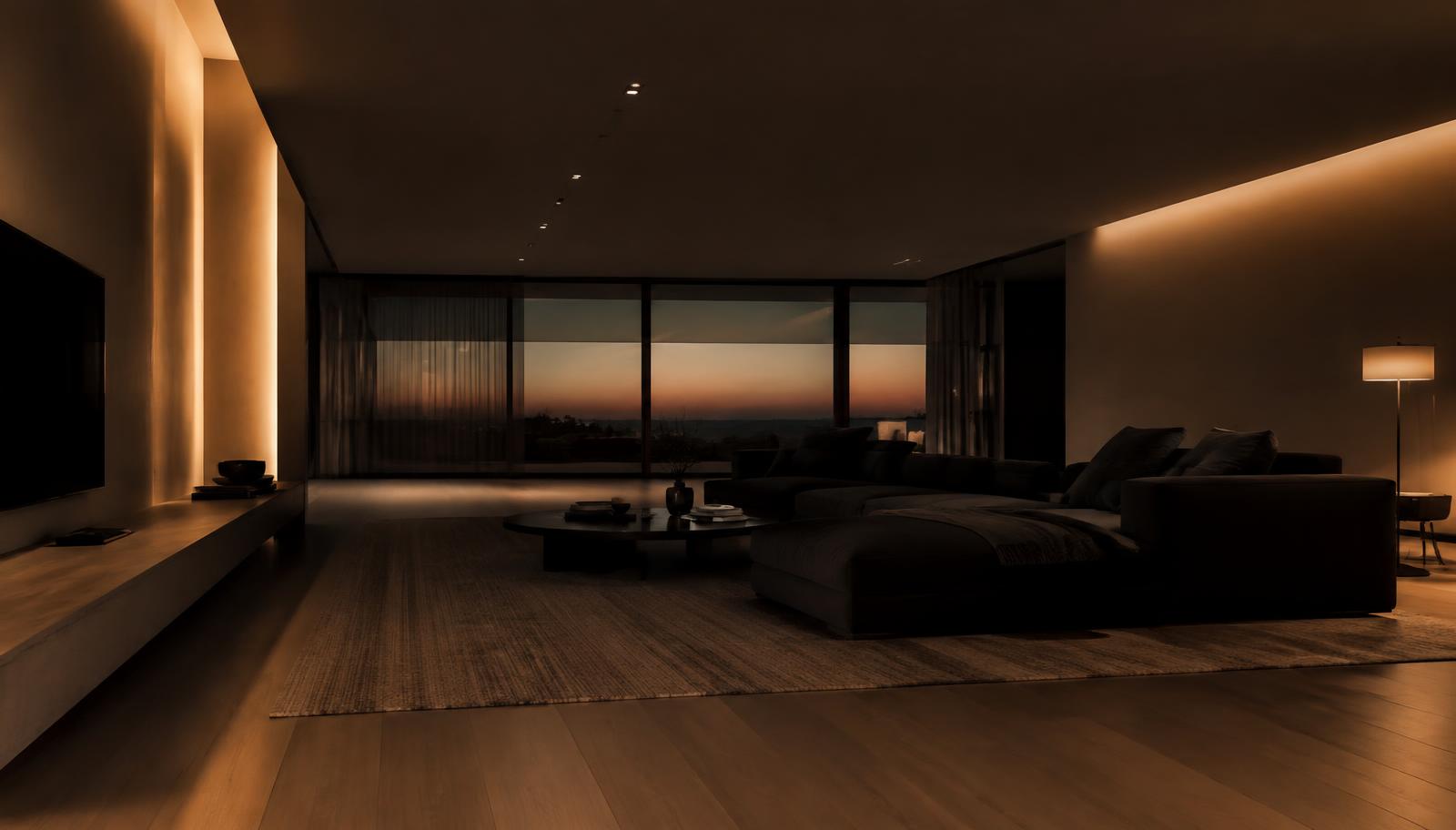
Two rooms with identical fixtures can feel completely different depending on one number: the colour temperature of the light.
Measured in Kelvin (K), colour temperature describes whether white light appears warm and amber, neutral, or cool and crisp. Choosing it well is one of the simplest ways to shape the character of a space.
Understanding the Kelvin scale
Lower Kelvin values produce warmer, more golden light; higher values produce cooler, bluer light. In architectural LED lighting, most products are offered in a handful of standard options, typically ranging from around 2700K to 6000K or higher. Always check which options a specific product offers.
Warm white (around 2700K–3000K)
Warm light feels relaxed and inviting, similar to the glow of traditional incandescent lamps. It flatters skin tones, wood and natural materials, and is the usual choice for living spaces and hospitality.
Neutral white (around 4000K)
Neutral light is balanced — neither noticeably warm nor cool. It feels clean and natural, and suits kitchens, bathrooms, workspaces and retail where clarity matters without the clinical feel of cooler light.
Cool white (around 5700K–6500K)
Cool light feels bright, crisp and alert. It is common in technical, industrial and some task-focused environments. In homes, it is best used sparingly, as it can make living areas feel stark in the evening.
Room-by-room guidance
Living rooms
Warm white is the natural choice. It encourages relaxation and makes materials such as timber, fabric and leather look rich. Combine a warm ambient layer with warm accent lighting on art or shelving.
Bedrooms
Warm white, with plenty of indirect or low-level light, supports rest. Avoid bright, cool light near the bed. A separate, slightly brighter task light for reading or wardrobes is useful.
Kitchens
Many homeowners prefer neutral white over work surfaces for clear visibility while cooking, with warmer light over dining areas. If the kitchen is open to the living space, consider warm or warm-neutral light throughout for visual continuity.
Workspaces
Neutral white supports concentration and accurate colour perception, and remains comfortable over long periods. Home offices that double as family spaces can use neutral task lights with a warmer ambient base.
Retail spaces
The right choice depends on the product. Warm light enhances food, leather, wood and jewellery in gold tones; neutral light suits fashion and homeware with true-to-life colour; cooler light can suit technology and silver jewellery. Consistency across the store matters as much as the choice itself.
Hospitality spaces
Hotels, restaurants and lounges typically favour warm white to create comfort and intimacy. Back-of-house areas and kitchens often use neutral light for practicality.
How light interacts with wall colours
Colour temperature and paint colour work together. Warm light intensifies creams, beiges, terracottas and warm greys, but can make cool blues and greens look muddy. Cool light makes whites look brighter and blues more vivid, but can make warm neutrals appear flat or grey.
Before committing, view paint samples under the intended light at night, not only in daylight.
How light interacts with materials and finishes
- Timber and natural stone usually look richer under warm light.
- Marble, concrete and brushed metals can look refined under neutral light.
- Brass and gold finishes glow under warm light.
- Chrome, glass and stainless steel read crisply under neutral or cool light.
- Colour rendering (CRI) also matters — a higher CRI shows material colour more faithfully at any temperature.
Creating different atmospheres
Colour temperature does not have to be one fixed decision per room. Tunable CCT products and CCT strip lighting allow the colour of light to change — cooler and brighter for daytime activity, warmer and softer for evenings.
Where tunable fixtures are not used, a mix of layers can achieve a similar effect: neutral task lights for function, warm ambient and accent lights for mood, each on separate circuits.
A few practical rules
- Keep colour temperature consistent within a single space unless a contrast is deliberate.
- Use the same product family for adjacent fixtures to avoid visible colour differences.
- Choose warmer light for rest and hospitality, neutral light for work and clarity.
- Test with real materials and finishes wherever possible.